Section 3 of five
Fifteen per cent is the whole argument
The 30% commission, the small-business programme, subscription revenue's share of app income, ARPU by market, user acquisition costs after ATT, and what the top-grossing charts show as public data.

Everything in The Numbers
6 pieces-
 Photo: App Store Icon · Wikimedia Commons
The Numbers · piece 1
Thirty Per Cent, and Nobody Argued
The history of the App Store's 30% commission from its 2008 introduction — when it was roughly what a physical retailer took — through eight years of stasis to the regulatory and litigation pressure that produced the 15% small-business tier.
Sources: Apple's published commission schedules and the Senate Judiciary Committee hearing record. -
 Photo: https://kaboompics.com/ / Pexels
The Numbers · piece 2
The 15% Tier in Practice
What the App Store Small Business Programme and Google Play's equivalent actually changed for developers under the threshold, who qualifies, and what the analytics firms' estimates say about the revenue share it affected.
Sources: Apple and Google's published programme terms; Appfigures estimates as of their publication date. -
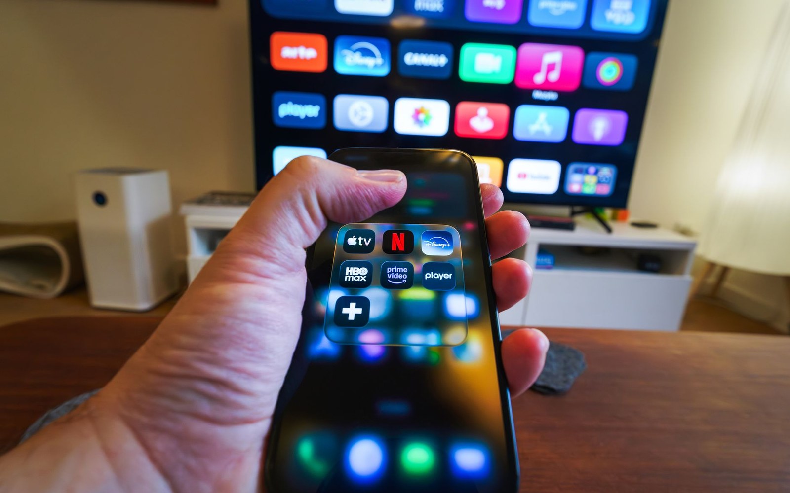 Photo: Jakub Zerdzicki / Pexels
The Numbers · piece 3
The Revenue Moved to Subscriptions
How subscription revenue came to dominate app-store income, displacing paid-up-front and in-app purchase, with Sensor Tower and Appfigures figures (attributed and dated) showing the shift by year and category.
Covers the commission structure difference — 15% after year one — and what it means for the top-grossing charts. -
 Photo: Brett Jordan / Pexels
The Numbers · piece 4
ATT and the Networks That Absorbed the Loss
App Tracking Transparency's April 2021 launch and its measured effect on mobile advertising revenue — Snap's earnings guidance warning, Meta's $10 billion loss estimate, and the shift to SKAdNetwork.
Reported as a market event with attributed figures, not as guidance. Sources: company earnings calls, published ATT documentation. -
 Photo: Alesia Kozik / Pexels
The Numbers · piece 5
Where the Estimates Come From
A transparent account of what Sensor Tower, Appfigures, and data.ai sell, how their estimates are constructed, who commissions the reports journalists cite, and where their methodologies diverge.
Makes the attribution chain visible that most coverage leaves implicit. -
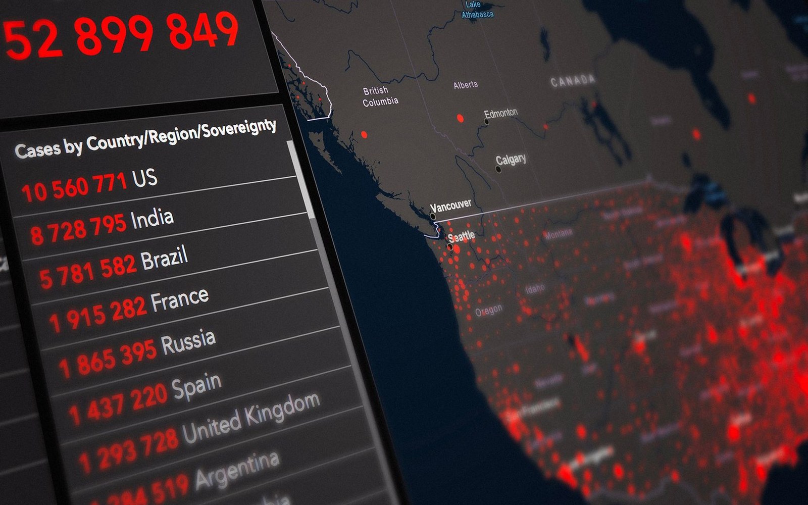 Photo: Atypeek Dgn / Pexels
The Numbers · piece 6
The ARPU Gap
Average revenue per user by market — US, Japan, Western Europe, Southeast Asia, India — and why the disparity matters for how platforms price commissions and how regulators in each jurisdiction frame their case.
Sources: Sensor Tower and Appfigures market reports, attributed and dated.